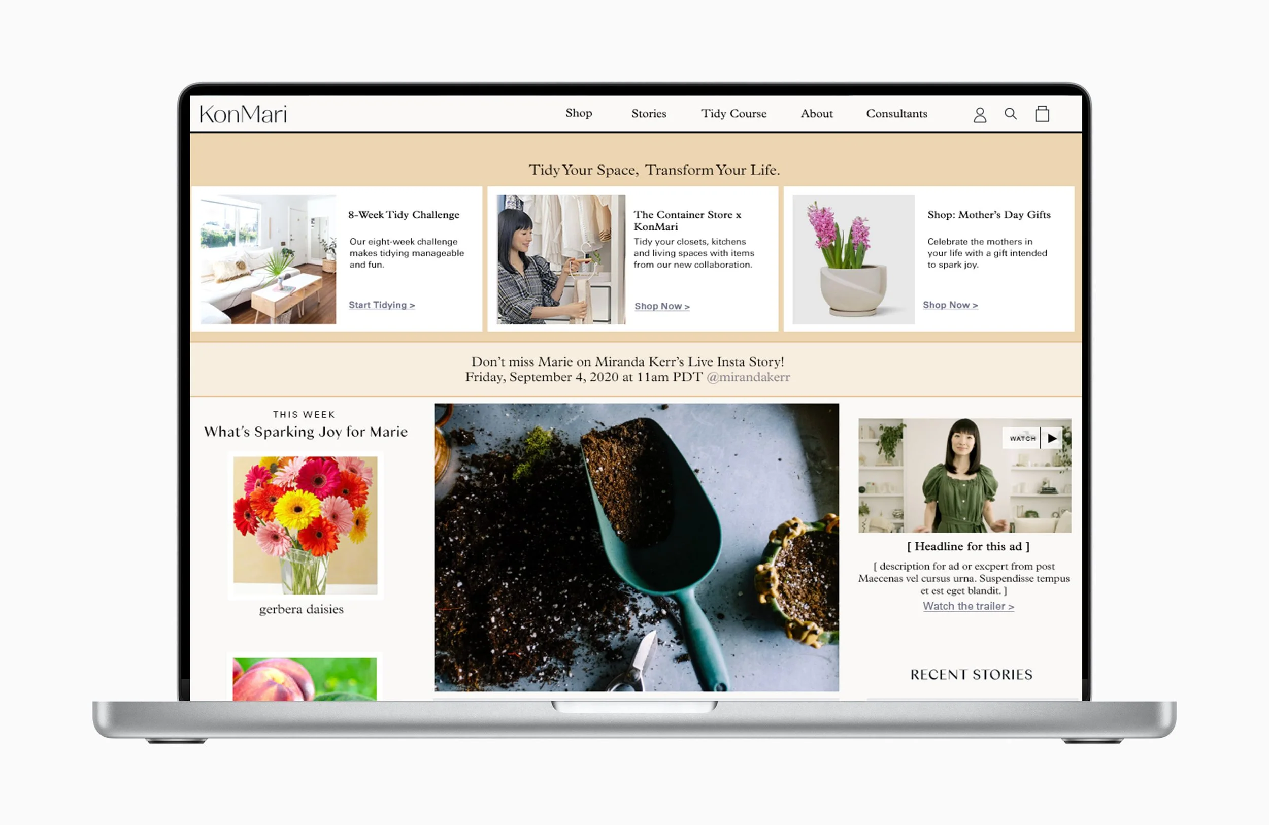
The homepage of Konmari.com was designed to be clean and luxurious, but it posed several usability issues. It was designed to only feature one large blog story with a very large hero image above the fold. This caused the following usability issues:
For return users, it seemed as if content refreshes were rare.
It pushed other blog content further down the homepage, and it was not designed with automation to reflect content publication schedules.
The homepage did not meet the needs of visitors who were arriving specifically to shop, learn about KonMari Consultants, learn about the Marie Kondo Netflix show, or specifically about the Konmari tidying method.
BEFORE:

AFTER:
Role: Director of Digital Product , Art Director
As KonMari pivoted to grow its brand beyond e-commerce and into the lifestyle space, it was critical to drive new traffic and return traffic to the website, and to guide site visitors more deeply into the site (both toward content and shopping).
User Journey
Heat-mapping was used to determine that over 80% of visitors to the homepage on desktop and mobile never scrolled more than 50% down the homepage, or beyond the carousel driving traffic to the e-commerce shop. While driving traffic to the shop was a strategic goal, the majority of visitors who did not navigate to the shop were bouncing away from the site rather than exploring content. The categories of the blog content were not distinguishable enough for users to understand them, and other areas of the site specific to Marie’s books, Netflix show and the professional training program were not receiving organic traffic.
The Process
After analyzing existing traffic patterns on the homepage, I audited competitor websites in the organizing, wellness and lifestyle spaces to determine vertical standards for the amount and type of content above the fold on homepages, in addition to messaging, CTA treatments and hierarchy of messaging.
I produced a series of wireframes for desktop and mobile in Sketch to share with the KonMari content team and stakeholders for input on placement of content modules. The wireframes were annotated once placement had been finalized to communicate stylesheet requirements to our developers so that the widgets would be produced to pixel-perfect specifications.
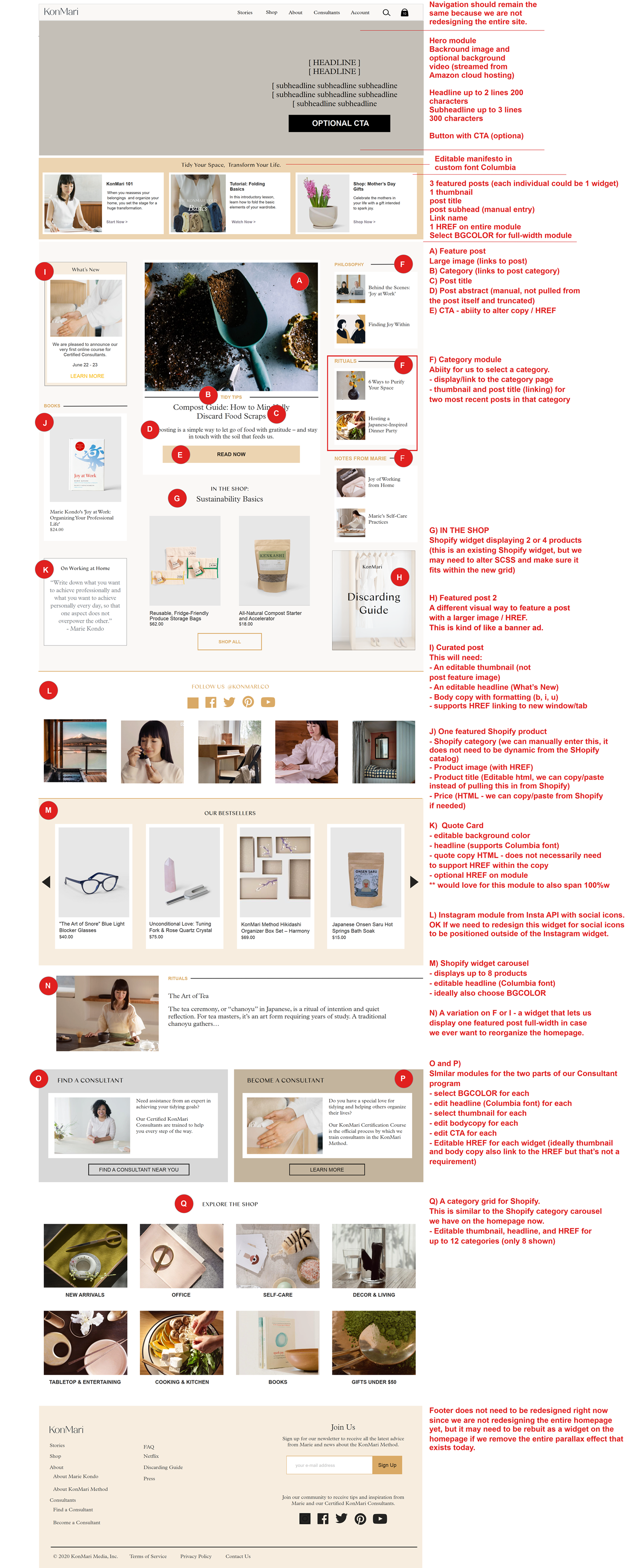
Annotated wireframe

Development and Launch
The homepage had been built on Wordpress, and migration onto another CMS was not within the scope of the redesign project. In addition to producing a more content-rich UI, as a Product Manager, I was tasked with assuring that the Wordpress interface for making updates would be simple enough for our content team to administrate. To achieve this, the new homepage was built using a combination of an updated style sheet and the Site Origin Widgets Bundle for Wordpress.
Since we were not embarking on a full website redesign, it was critical to retain the existing theme’s responsive breakpoints, grid, and navigation.